

Introduction
Cloudy Car is an Uber-like application that enables users to become drivers and riders. Cloudy Car was built for my Software Development class as a group project. The professor outlined User Stories for us to turn into a functionality spec. The following post will provide a detailed walkthrough and critique of some of the design choices made.
Walkthrough Part 1: Opening the app
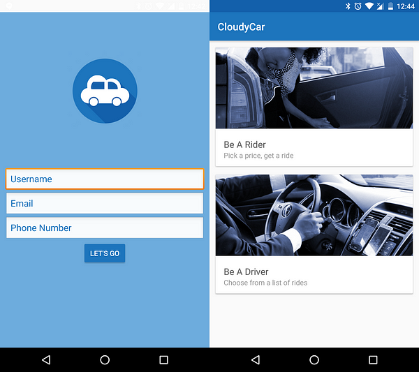
Upon first opening the app, users will be introduced to a signup screen where they will be asked to create a username as well as submit their phone number and email. The user is requested to provide both a phone number and email as a way for drivers/riders to easily contact each other later on in the application. Minimal information is asked for from the user as this in less intrusive to the user and also builds more trust. Arguably, email is not required in this step and can be made “optional” or even removed entirely.
The button labeled “LET’S GO” will revert the user to the next step. The phrase “let’s go” is preferred over phrases such as “submit” or “sign up” as it entails a more enthusiastic tone and increases clarity for the user in making the decision to sign up. Perhaps a better option could be “Start Your Cloudy Car Experience”; while this clearly states what the user is doing, it is a very long phrase for a simple screen.
Once this process has been completed, the signup screen will not be shown again since one phone does not require multiple accounts. This design for minimal user interaction makes the app more appealing and easier to use.
Once signed up, the user is then guided to the home screen where they are given the option to enter either the driver or the rider side of the application. This screen has only two buttons to signifying a significant action. Both buttons have themed pictures and text copy to make both options more clear to the user. These minimal and clear options help the user make the right decision based on their situation. An improvement to this page could be made by telling the user that this action can be reversed in the future, without this the user may feel more pressured when making their choice.
Walkthrough Part 2: Beginning the Request
After picking which side of the application a user would like to utilize, they are refreshed to new screens based off of their choice.
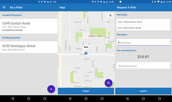
The rider portion of the application showers users four main tabs: requests pending Driver acceptance, requests accepted by a Driver, accepted requests that the Rider confirmed, and a floating action button to create a new request.
By clicking on the floating action button, the user is redirected to a map where they can set pickup destination and a drop off destination. This screen also holds a description box where users can input special messages such as a pickup time. This screen also suggests the user with an estimated price that they can use as a base point in submitting their price point. The option for riders to submit the amount they are willing to pay for a ride does not make sense entirely; however, this spec was a requirement set by the professor. Having this option also allows drivers to price discriminate as riders will enter the maximum they are willing to pay, and drivers can pick the highest paying rider to drive around. If users do not fill out this box, upon clicking the submit button, the recommended price will be auto-filled. This screen again shows minimal design, only featuring UI elements required for a user to make decisions. This screen could be improved by some text copy explaining different options such as taping the map to select a drop-off destination point and that dragging the blue stat point changes the pickup destination. This lack of direction can make users feel stuck or confused as they do not know what to do or have difficulty in submitting destination points.
After submitting this information, users are shown a summary of their request and are given an option to edit different elements. This screen could also include more direction as to the various options users have to adjust their pickup and drop-off plan. After submitting the request a second time, the new request will be listed under “pending requests”.
Walkthrough Part 3: Accepting the Request
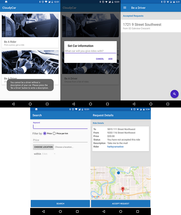
After users create a request from the riders side of the application, the driver side of the application comes into play. The driver’s side of the application is set up in a similar manner to the riders side. Users on this side are a list of request forms that they have accepted in the past as well as pending request they can accept at any time they choose. This screen also has search buttons for drivers to look up more pending requests using different filters to eliminate request options.
For identification reasons, before a user can enter the driver side, they must first describe their car . If a user tries to get into the driver-side from the hamburger menu in the rider-side, the app brings the user back to the home screen and displays a message to clear any confusion as to the user’s actions.
After selecting a request, users are then redirected to a request details screen where they can review and accept the request. A link to the rider’s profile details is also present on this display. Accepting the request will add the request to the “accepted requests” list in the driver-side main screen.
Walkthrough Part 4: Confirming the Request
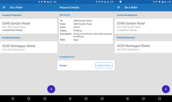
For riders, accepted requests will now show up under the “Accepted” subheading on the main rider-side screen. Riders can navigate through the details page by clicking the request; this will show pickup and destination locations and the list of drivers who accepted the request. This gives riders an opportunity to view the different drivers’ profiles, to provide them with a larger sense of security. Once the riders confirm a driver, the driver is notified, and the request will be shown under the “Confirmed” subheading.
Walkthrough Part 5: Miscellaneous
Hidden gestures such as tapping the map to set destination point or swipe to delete functionality on requests can be handled in many ways, some of which are outlined in an article by Nick Babich and can be read about here.
There was much debate over the hamburger menu is kept in a consistent place for users to view their profile. Quick links are also strategically placed on both the rider and driver sides of the application to increase usability. A fix for this function would be adding a setting option in this menu.
The colour scheme was chosen in accordance with the logo and different shades of grey to make the app easy to see and consistent throughout. Colour can be a good way to call for users attention, mockups for the app can be seen on figma.
Conclusion
This app was designed with the given User Stories as requirements. This allowed the design of the app to be our own — thus allowing me to use design tactics learned from reading Medium articles.
Aside: App mockups were made with Figma, the online version of Sketch, and can be viewed here. Note that the mockups differ slightly from the actual screenshots.
Co-creators of app: George Antonious, Ryan Huard, Harley Vanselow, Steve Boddez
Github: https://github.com/CMPUT301F16T12/CloudyCar
Editor: Sonia Kalburgi