

How do you create a brand for a legal tech client? What does a legal tech brand look like? What does it feel like?
Objective:
To create a new brand and website design for Legalicity, a Toronto based legal tech startup. A brand that reflects the personality of the company and suits both industries they operate in.
Legalicity:
LegalTech is an up and coming sub-industry in an industry where innovation is not a key word. Legalicity works in this difficult space, using technology and computer science to bring innovation to the industry. Currently Legalicity is working on their first product, which has it’s own website, NLPatent.com
Separating the product and company into two websites created an information fragmentation for both sites. Visiting one leaves visitors unaware about the other, leading to Legalicity being written off. The client would not allow us to merge the two sites. This would mean that we would have to somehow connect the two sites, doing that visually would be a huge challenge.
Design Inception:
Legalicity’s most obvious visual direction is clean and blue. This style is common among technology company’s for it’s friendliness and trustworthiness.
It’s a simple solution except that it wouldn’t make the Legalicity website unique to Legalicity as a company, nor would it mirror the visual from the NLPatent website. Instead, look to why Legalicity needs a website.
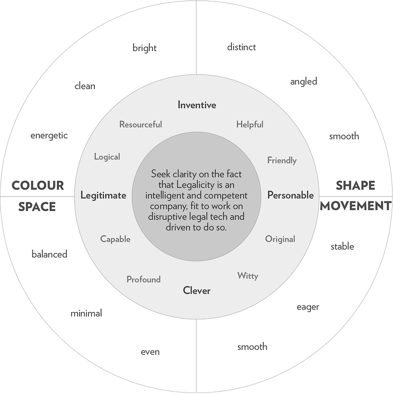
Legalicity needs a website that communicates their competence in the industry and their originality as inventors. These can be brought about by using the visual elements of colour, shape, space and movement.
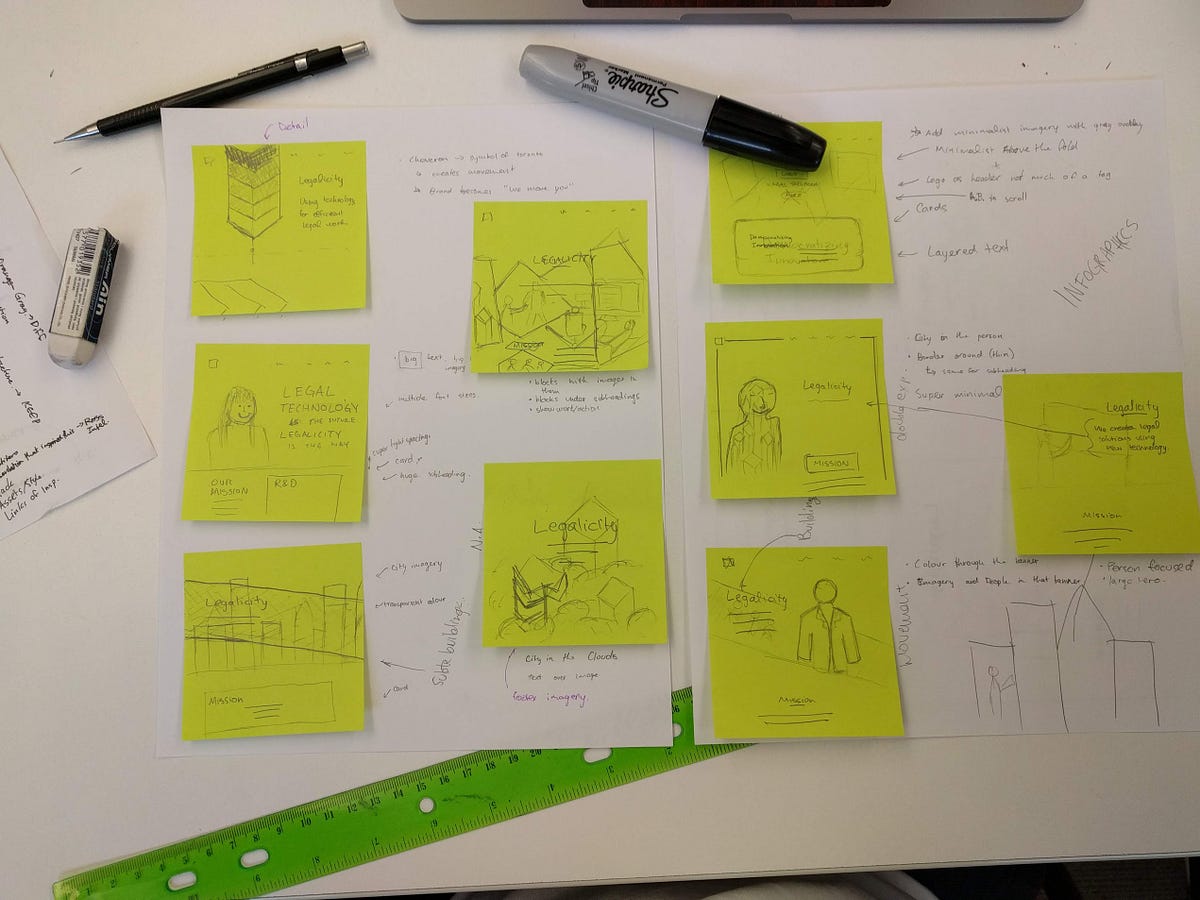
Mood Boarding:
I began to look up how blue can work with the orange of the NLPatent website. I also looked for strong shapes that resembled buildings (“city” is in the word Legalicity).
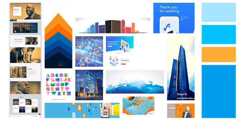
The mood board captures a fun energy but also a professionalism. It features sharp edges and sense of strong stability but also a lightheartedness in the colours.
I ended up falling in love with the chevron shape in the moodboard and used it throughout the design process. It’s a strong and stable shape that law firms would like, but also directive and challenging that a technology startup would push for.
Styling:
The style tile is a representation of the visual design of the art direction and the style guide shows the technical elements of the style. They feature different elements of the app, ranging from atomic elements (font, colour, icon) to molecular elements (buttons, visualizations).
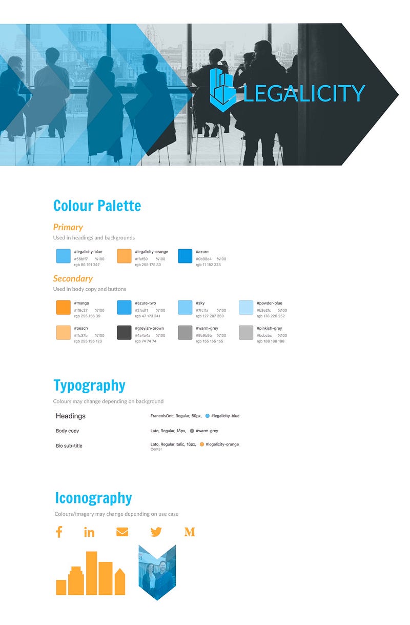
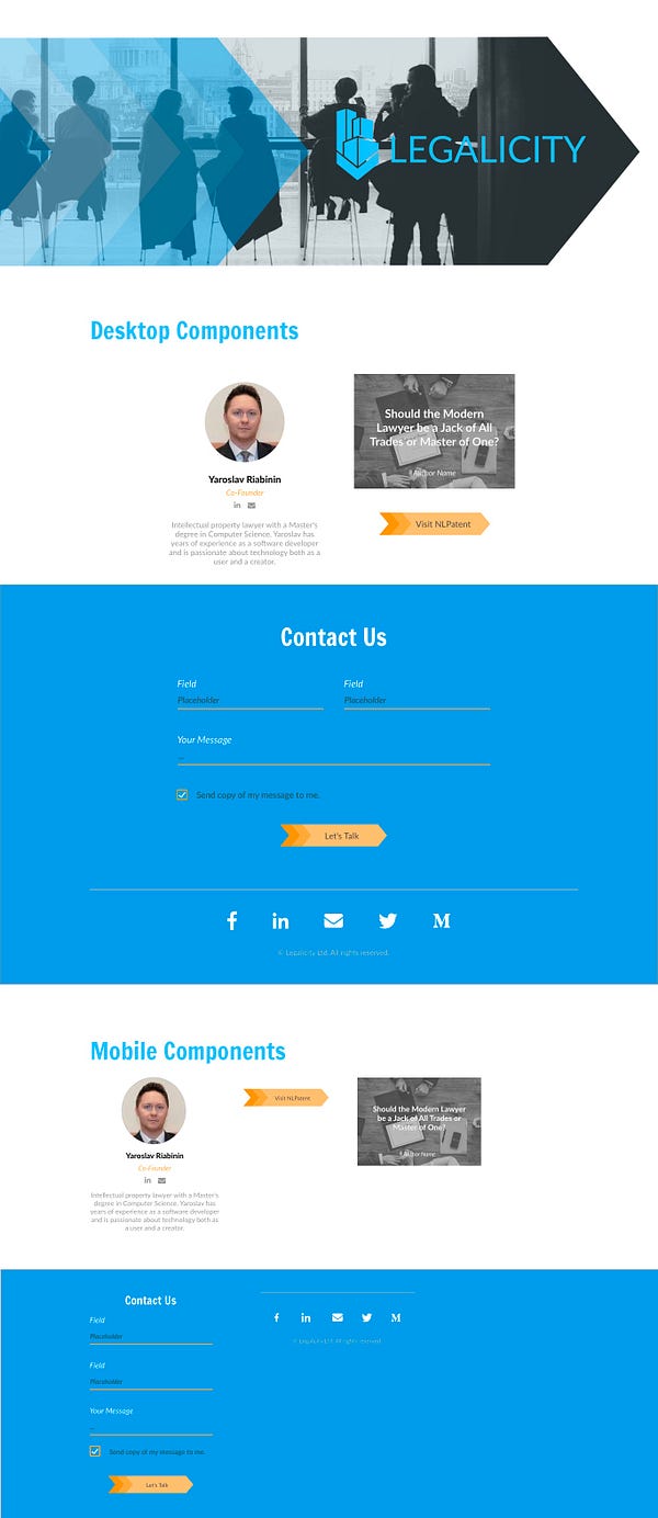
The designs show the visual direction decisions made during the inception phase. There is the chevron shape, bright colours and the clean design.
The best part of this design is how the angles and shapes mirror that of NLPatent. There aren’t any matching elements from the two sites, but they simply feel connected thanks to the angles. It’s awesome.
More Than A Few Iterations:
Because my goal for this project was to do a lot more design iterations, I did a lot of design iterations:
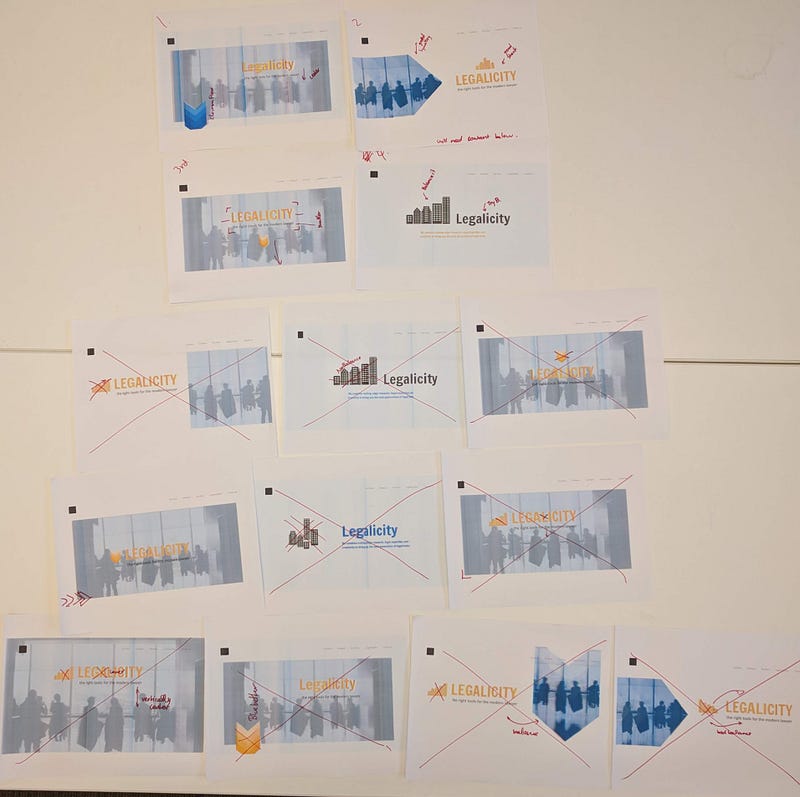
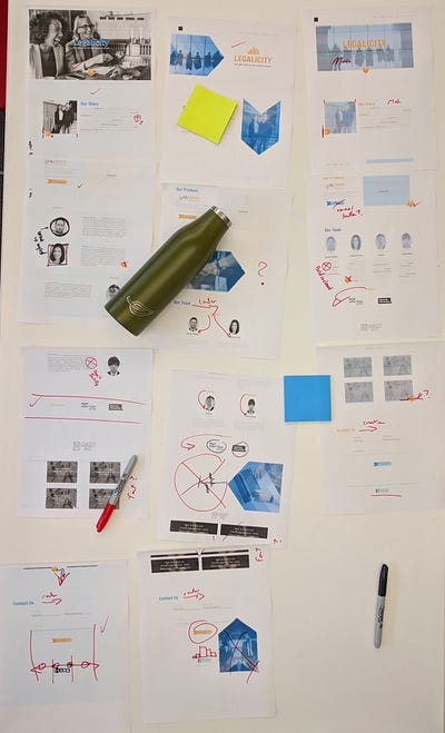
I first did a design blitz on sticky notes, and went over them with my team. Those were used to build a number of “above the fold” designs. Which were then honed into 3 final full web designs. Those were showed to the client who chose the “blue chevron” design. Overall I loved my process of design iterations, it worked out so well. I had some difficulty maintaining the iterations through to the final design and polishing the design towards the end but otherwise I loved this process.
The Results
The design language I’ve built for Legalicity feels unique and modern, resembling the company at its core. Legalicity is a personable company of inventors that want to help lawyers, they’re professional but also friendly. The website is going to help lawyers understand that, and also what the company does. With this, Legalicity will be ready for it’s marketing push come September when the latest MVP is complete.
One thing I could have improved is justifying more of the design decisions. Being more stingy about maintaining why I’m doing things.