

How do you create a visual language for a mobile app? What does a good visual language look like? What does it feel like?
Objective:
To create an engaging, impactful and well-designed UI Library using Sketch and the supplied wireframes. To conduct some research on Runnr and its target audience.
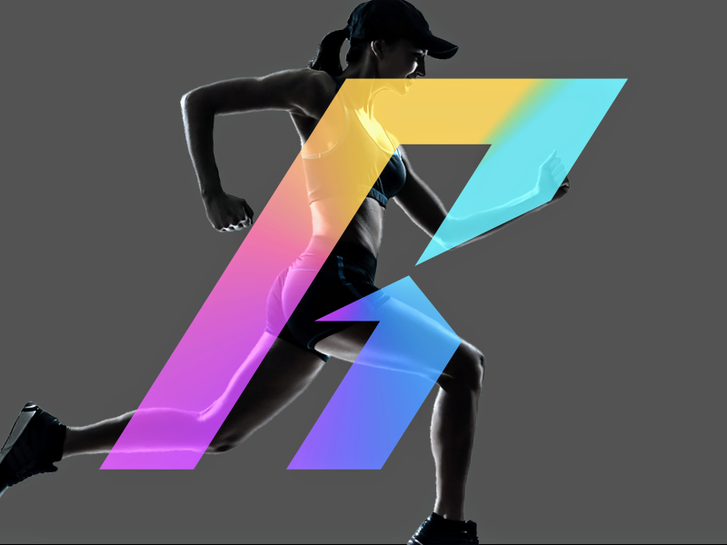
Runnr:
A running app featuring tracking and progress, but also free music streaming. This combination allows for the ability to choose playlists based on the run; e.g. mood, pace, distance, or type of run. Runnr will keep runners on track and motivated to keep going.
I personally don’t have any experience with running apps, but I did have experience with fitness apps in general, and based on that experience I wanted to visually play up the motivational ability of the app. That being said, my early assumption that my weightlifting apps and this running app were the same was a mistake.
Design Inception:
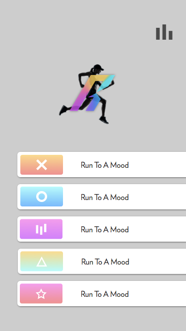
Runnr’s most obvious visual direction is to have the app reflect users’ chosen mood, since the user can choose a playlist based off the their mood.
It’s a simple solution except that inconsistencies can confuse and/or alienate and thus would have to be implemented very carefully to work. Instead, look to how and why users would want to use the app.
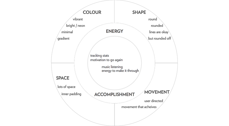
Users would want to use Runnr for tracking their stats and listening to music in one single, consistent experience. The stats will be what gives them the motivation to further their progress and the music will help them ground and focus their energy in their performance. These can be brought about by using the visual elements of colour, shape, space and movement.
Mood Boarding:
I began to look up how bright colours can be used to promote energy and motivation, and specifically in fitness apps. I also looked for round shapes and icons in app design.
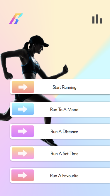
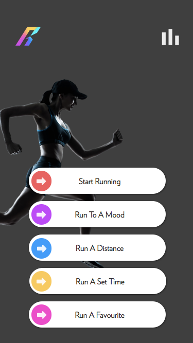
The mood board uses a darker grey to ground the energy of the bright colours, creating an energized but calm feeling. It features a lot of round edges and space to let the energy of the colour flow throughout and around the app elements.
I also looked for interactive app elements that I could incorporate into the app as a way to get the user to feel accomplishment as they navigate through it. I particularly fell in love with Apple’s old Swipe to Unlock, though it’s left off the mood board for it’s old design style. These interactive elements became a pain point for me later on in the design process — fleshing them out more here would have been more ideal, they created issues later on.
Styling:
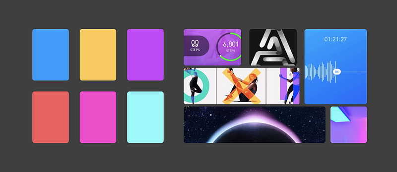
As the style tile should be a representation of the visual design of the direction, I created it, and the style guide, in the dimensions of an app.
Both feature different elements of the app, ranging from atomic elements (font, colour, icon) to molecular elements (buttons, visualizations).
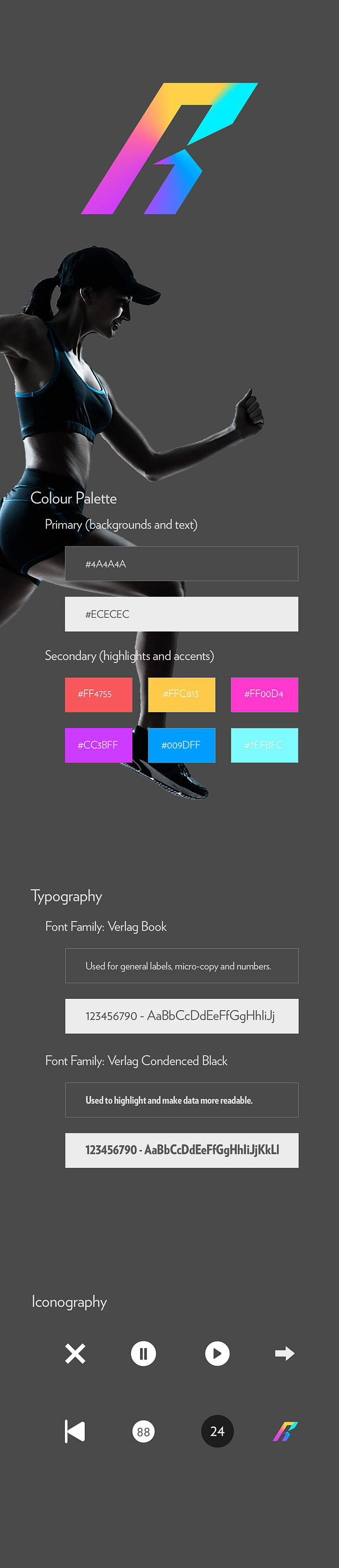
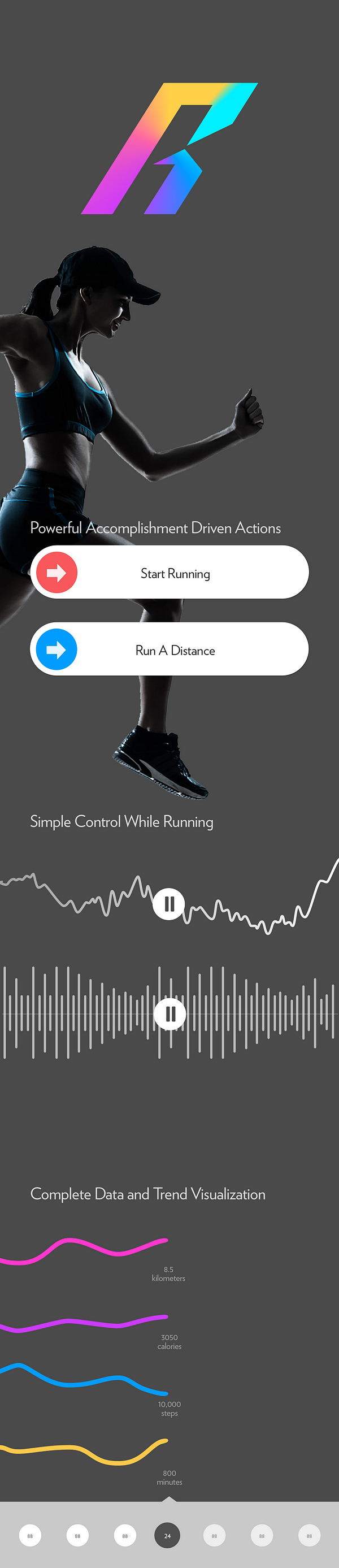
The designs show the visual direction decisions made during the inception phase. There is lots of space, powerful bursts of colour, and rounded shapes.
The user initiated movement unfortunately took a backseat, I had struggled implementing it. While designing I realized I was missing information and tools to understand how and why users can use user initiated movement. Working without the usability and UX research made it difficult to incorporate such a unique element into visual language.
That being said, I was still able to incorporate movement into the app using the arrow icon and the data visualizations. I don’t think this makes up for the original concept I had though, I’d like to learn more about the visual language of interactive elements and learn how and when to implement them.
A Few Iterations:
It’s worth noting that the mood board and styling shown took a few iterations to achieve. I went through a grey phase, a hyper-gradient-rainbow phase before reaching this dark phase.
Overall I liked how it came together, but I think I learned a valuable lesson in oneitis. Don’t. Be. Attached. To. Your. Designs. In the future I’m going to do a design blitz (10 2 minute design sessions) in order to spark more creativity and alternatives.
The Results
The design language I’ve built for Runnr feels strong and powerful, effective for an app about, essentially, control. Users have a clean and singular running experience featuring simple and easy control of their music and tracking. In the colours and space, the app communicates an energy to use that strength and power with. The clean data visualization and forward arrow iconography help to motivate runners to continue running and progressing.
One thing I could have improved is the microcopy of the app — it’s fairly neutral as it is and I’m interested to know how changing it’s tone would improve the experience. How would a positive tone differ from an aggressive tone?
View the final project here:
- InVision prototype (recommended)
- GitHub source
