How do you create a visual language for a mobile app that must follow specific UX goals? What visual language do the users want? What feelings do the users want?
Objective:
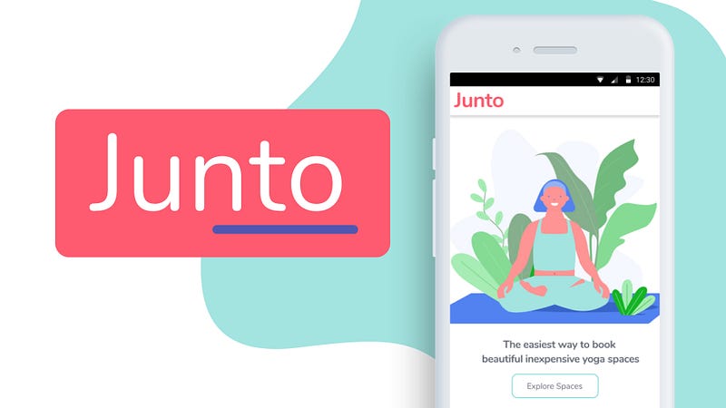
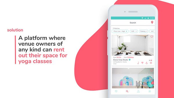
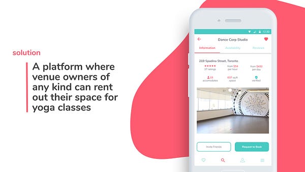
To create a clear, goal-oriented and well-designed application around helping yoga teachers to find spaces for their classes. To find plausible business objectives to ensure viability of this product, and design for those objectives.
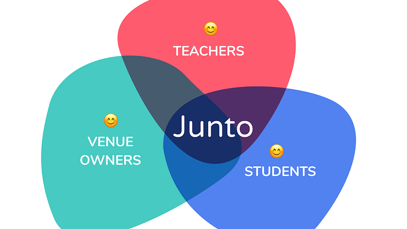
Junto:
An Airbnb-like app that’s just part of the product line that would be offered to connect venue owners, yoga teachers and yoga students. A complete redesign of the yoga industry experience and financial model.
I personally didn’t have any experience with the yoga industry, but thanks to my phenomenal group, I soon learned. That being said, we soon discovered that we never considered the implementation strategy for this business to succeed.
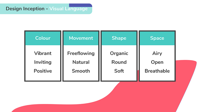
Design Inception:
Junto’s most obvious visual direction is to have a kind of airy editorial. In the end, that’s what the client ended up choosing.
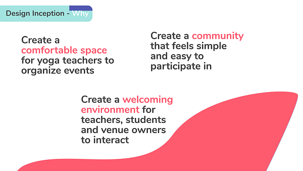
The airy editorial art direction was built to appease yoga teachers. Vibrant and positive colours with open space and organic shapes. Pretty zen to me.
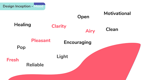
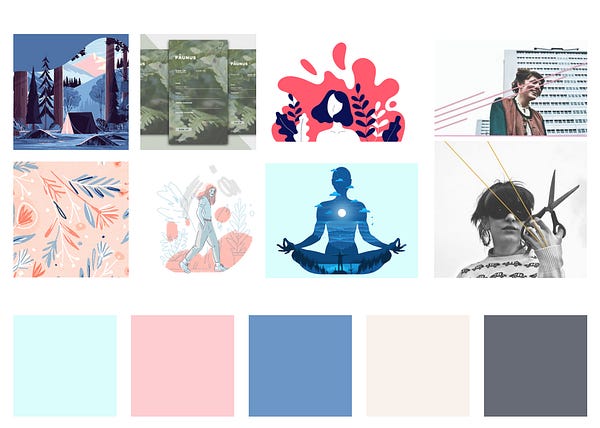
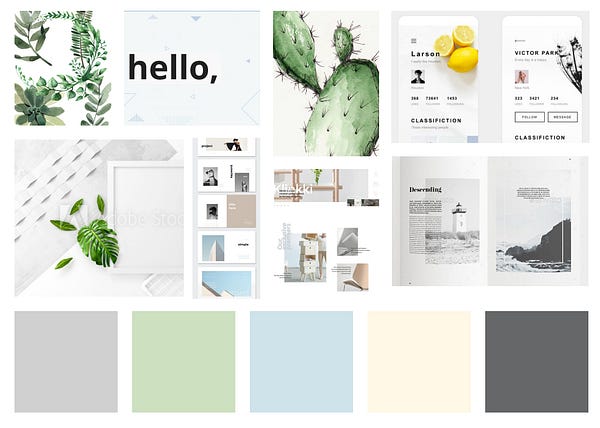
Mood Boarding:
We ended up mashing up two separate mood-boards into one. Our client loved the overall vibe and feeling of the Mind and Body mood board and we added the space and visual direction of the Open Editorial mood board to it. The editorial theme was needed for it’s heavy content-based direction, this app is also heavily content based.
Styling:
As the process continues, many parts of the design are subject to questioning. The style tile directions ended up forcing us to change all the colours of the app as the baby pink/blue just wasn’t working for us.
Eventually these colours got changed as follows below.
The brighter colours reflected more positivity and was much more accurate to the vibe the client felt was needed for this project.
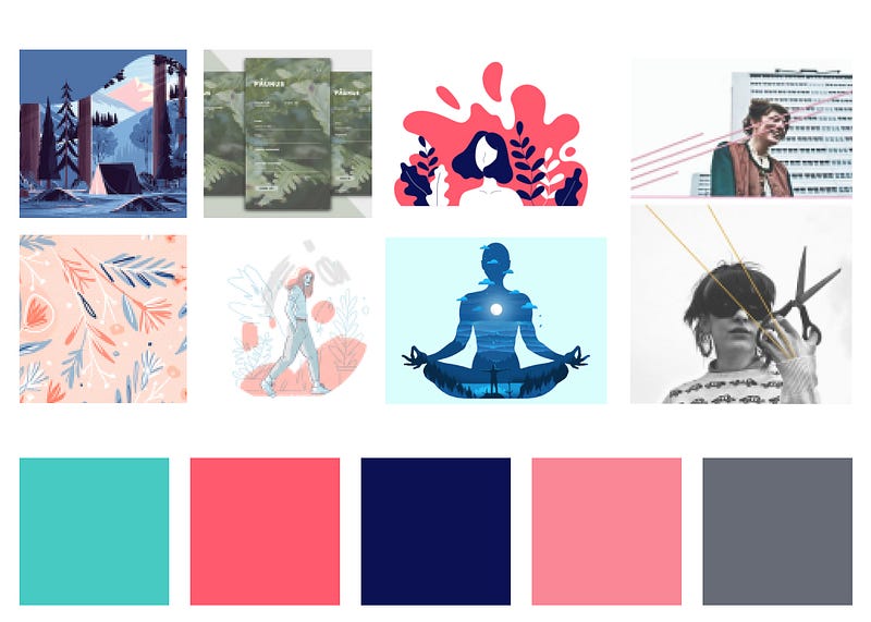
The final stylings thus show the visual direction decisions made during the inception phase and as changes occurred. There is lots of space, powerful bursts of colour, and rounded shapes.
A Few Iterations:
Working as a team for this project, the work went through many different types of iterations before finally getting to the end result. There was a lot of disagreements on Android/iOS standards, font standards and more. I think utilizing Figma’s components would have helped a lot of these — but in the end the individual differences and creative freedoms is what allows for the best possible work to be produced. If only there was an easier and more objective way to figure out the synthesis of those differences.
The Results
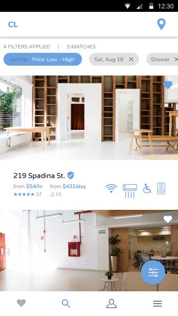
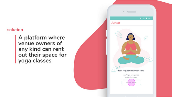
The design language we built for Junto feels strong but fresh, effective for an app about, essentially, freshening up the yoga industry. Users have a clean and singular experience featuring very straightforward user flows that are easy to understand for their priorities.
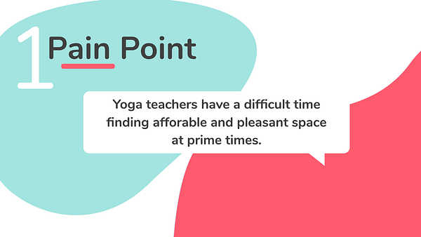
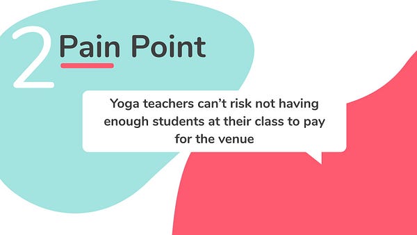
For this project, we only hifi’d user flows for the teacher portion of the app. This is because the teacher is the stakeholder that interacts with the other two stakeholders, the venue owners and students. We summarized these interactions to pain points for the yoga teacher:
and
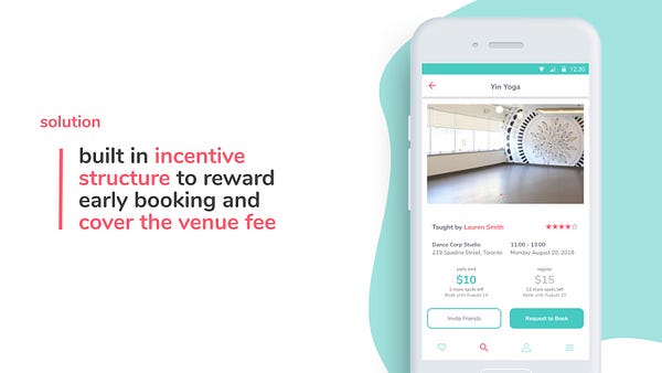
Because we focused on the yoga teacher, the client would unfortunately need a much better implementation strategy than just building and launching the app we designed. I recommended starting with a different app specifically for yoga studios and venues to rent in order to build relationships with that that stakeholder group.
In the end though, Junto will connect the three stakeholders and the yoga industry will officially be tech‘ed out 🤙🏾