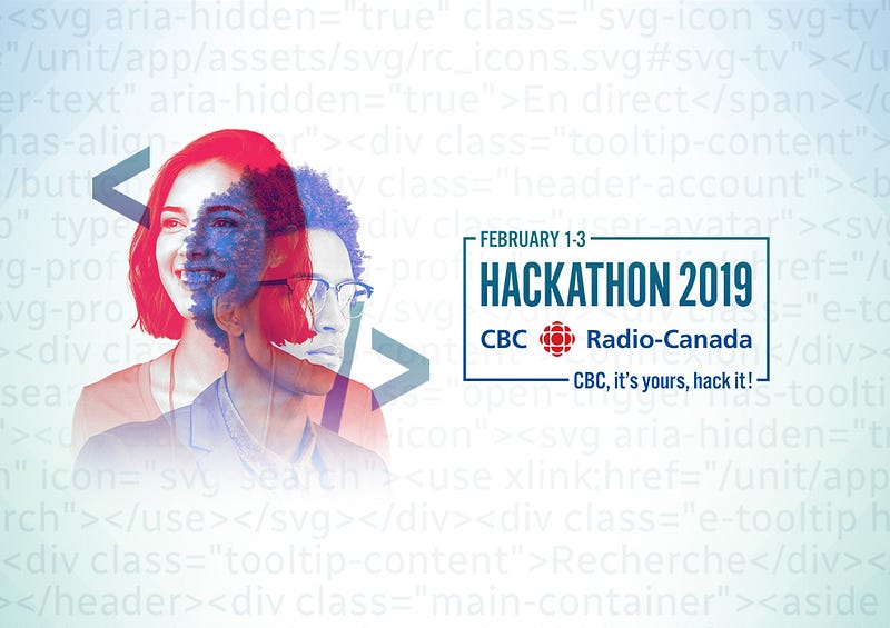
This weekend I teamed up with my friends Abid and Meg to participate in CBC Radio-Canada’s hackathon all about personalization.
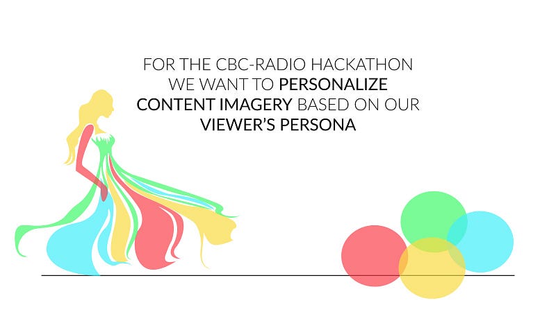
Our team chose to personalize the content imagery that viewers can see across CBC’s website.
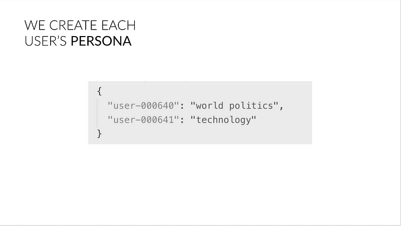
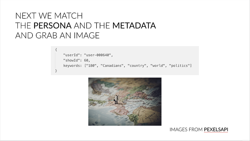
We created user’s personas using the articles they read previously to determine their interests:
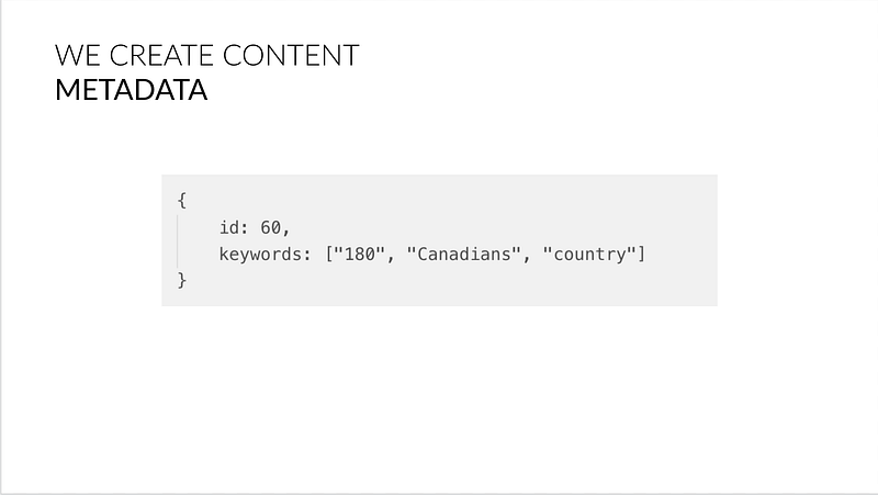
And created metadata for the CBC content using Google’s NLP API to find topics from the content’s description:
To decide what to show the viewer, we match the two sets of keywords together and use it for our image lookup.
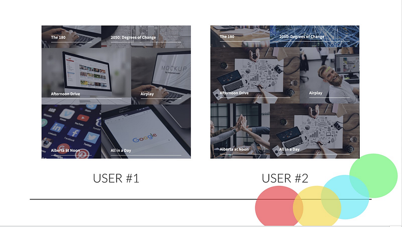
And thus, we have two different UI’s for the different users.
Developing Engaging Images
I worked on the front end (and a little bit of design) for the project.
Hackathon Starter
There’s a github repository called the Hackathon Starter that we used to quick start the application. It’s just a simple boilerplate Node.js app designed to be as versatile as possible.
I cleaned out most of the app and built my own view using HTML5UP’s Forty template that would become the view of our app.
Implementing the API
Next I used axios to call the API my group-mates prepared for the front-end and created a new router for the application to take in a userId from the URL.
Inputting the userId from the URL just made sense for this project since CBC Radio Canada doesn’t actually have accounts, so user data is actually stored through browser cache. Using a router was better than creating a “log in” page since the real CBC Radio Canada wouldn’t have a log in anyway.
Fixing the Design
HTML5UP’s Forty is a great template, but it didn’t follow Radio Canada’s mandatory accessibility guidelines. I put a bit of my CSS and design skills to work fixing these issues.
First I fixed the text size, good accessibility should have text size above 12px.
Then I fixed the colour contrast of the white text on the image content tiles by changing the colours to values that have acceptable contrast.
I also made sure that text was not uppercase . Uppercase text is harder to read and screen readers will read this text as shouting. A poor experience.
Lastly I added an animation to only show descriptions on hover, this was so that you could better see the images in the background. Accessibility guidelines state that all hidden text should still be readable by screen readers, so I found a way to create the animation without using display: none.
Results
In the end we did what we wanted, creating an entirely new experience for Radio Canada viewers with personalized content. We’re really proud of our work, this was a great project.
 (Note text here is uppercase because it is an old version)
Tell me how it is via Twitter or Instagram!
Bonus,
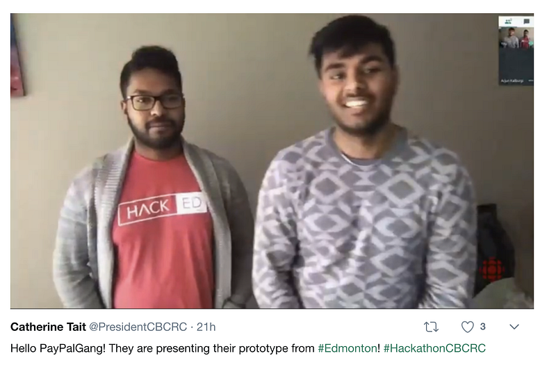
such a bad screen-grab from the President of CBC Radio Canada 😂