How do you create a better experience for something you know your users won’t want to do? What steps can the visual language take?
Objective:
To create a friendly, professional and well-designed brand and on-boarding experience for expertise input, the process of defining and contextualizing what you are good at.
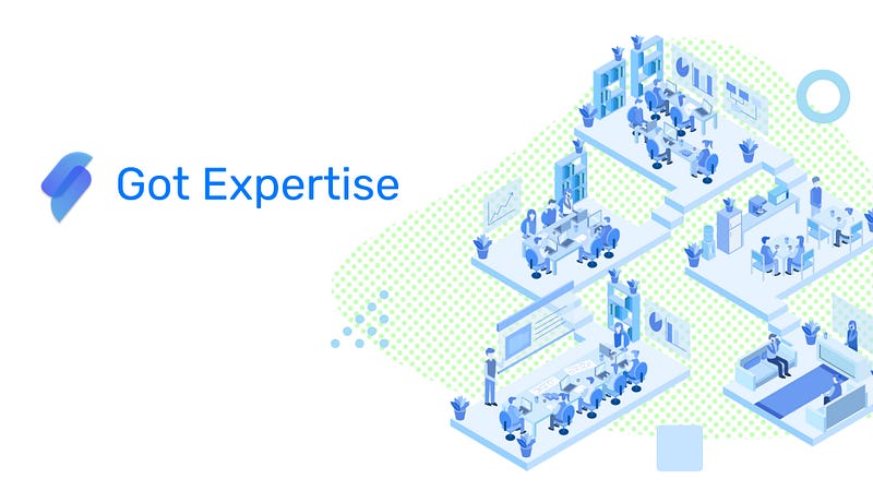
Got Expertise:
A product set to solve expertise search, the idea to uncover knowledge from across a company. If RJ has relevant company information about 10 year old software that only 1 current client still uses, and Nauka is brand new to the support team and gets a call from this client, how will Nauka know that RJ is the person she needs to help with her support ticket? Solving this problem could be untapping a billion dollar of monetary value in worker productivity.
Design Inception:
To begin, I thought about why users would use this product and what they’d need from it. I broke it down into 3 objectives:
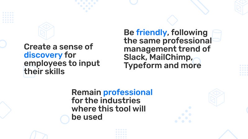
Discovery to try and make sure users have a great time. Professional as this would be used as an enterprise software. And fun, because fun is better (and now more acceptable).
This came through when thinking of moods to embrace and visual language components to feature.
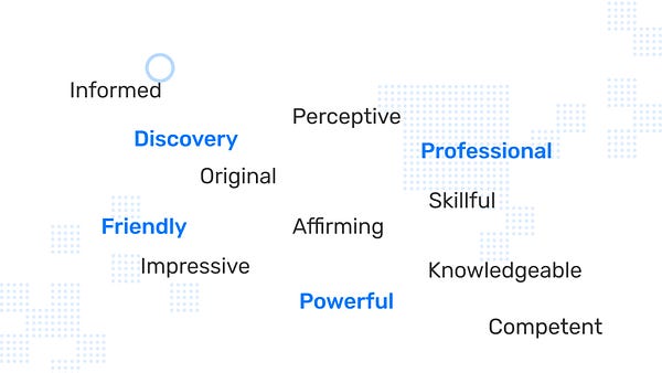
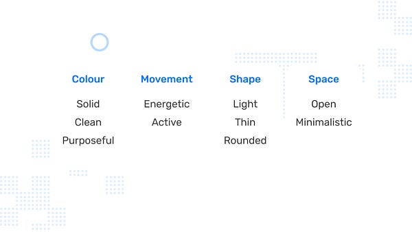
For example, a professional tone is struck with minimalistic space, solid colour and light shapes. A fun tone is struck with rounded shapes, open space and energetic movement. I used these to design the brand and experience.
Mood Boarding:
The client liked the safer mood board which I called “Thinking Technology”, going for the classic blue tech theme.
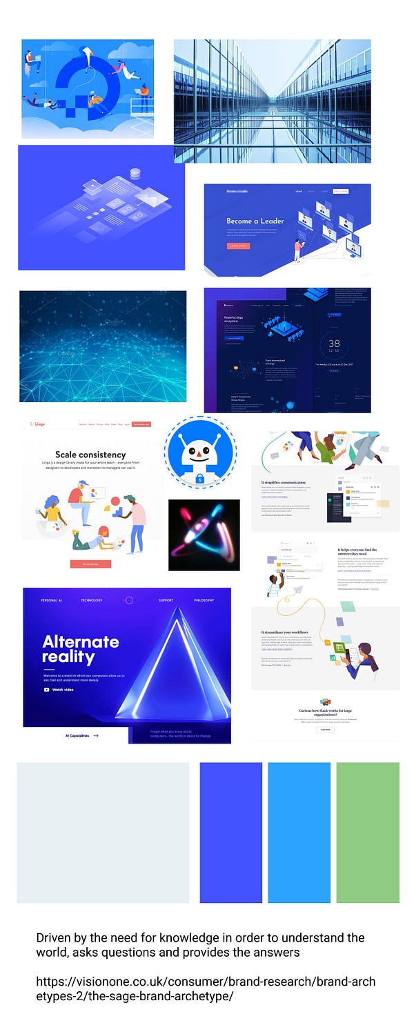
I did something different with the mood boards by including a persona for the chatbot I’d be designing for.
The persona in the Thinking Technology mood board chosen by the client was based off the Sage archetype.
The Sage character archetype is driven by the need for knowledge. They’re usually the ones that are constantly asking questions and wondering why things the way they are.
This persona experiment was really fun but I’m not really sure I executed it in the final hifi’s. Creating characters and making UIs are very different skills. Interesting lesson in character development nonetheless — I’m excited for the next time I do a chatbot!
Styling:
For this project I tried to go with 3 widely different directions for the style tile. I wanted to push myself to see completely different possibilities from the mood board above. This goal slightly backfired on me, as two of the three style tiles didn’t quite feel like fully developed pieces. They had potential though — it was a fun experiment.
The chosen style tile was the minimalist one as shown above, aptly titled “Minimalist”.
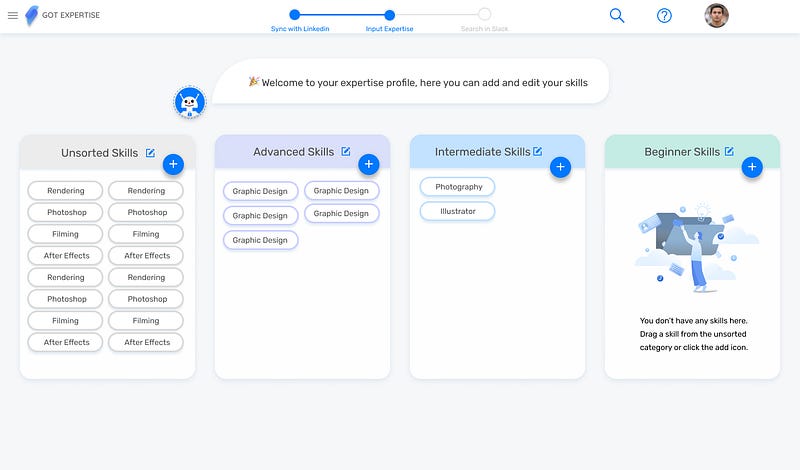
Quick HiFi Development:
Usually I go through many iterations during the final HiFi stage, but surprisingly — this design was very strong out of the gate. Their quick development helped us get back on track (we were fairly behind UI-wise) and were universally accepted from the instructors with only a few minor things requiring fixing.
When you develop skills in a new area, sometimes it’s difficult to feel accomplished (ie imposter syndrome). Being able to knock out the HiFi’s fast and well made me feel really awesome and a worthy designer. It was a great way to end the project.
The Results
The design language we built for Got Expertise feels clean and powerful, effective for an app about, essentially, cleaning up large bureaucratic companies and making them more efficient.
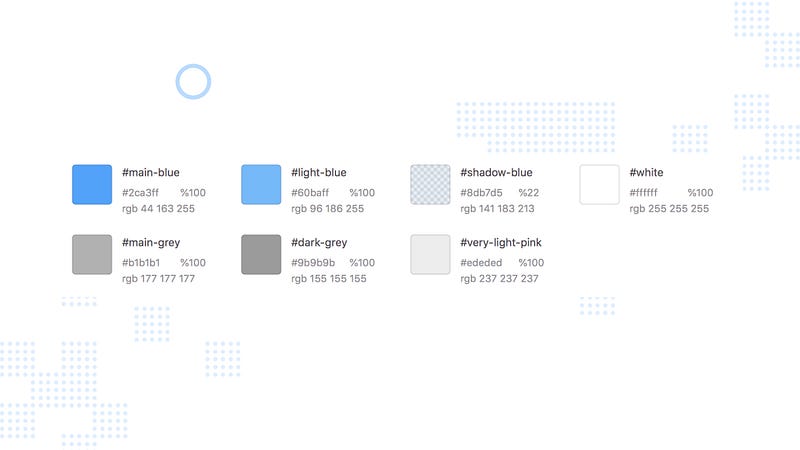
Monochromatic blue colour palette that’s both professional and friendly.
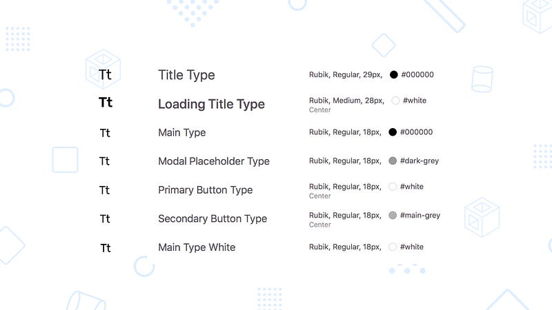
Rubik type that’s got rounded corners but not too rounded, the balance is professional and friendly.
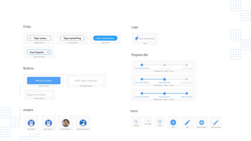
Application elements that are blue monochromatic and rounded to be functional and interactive.
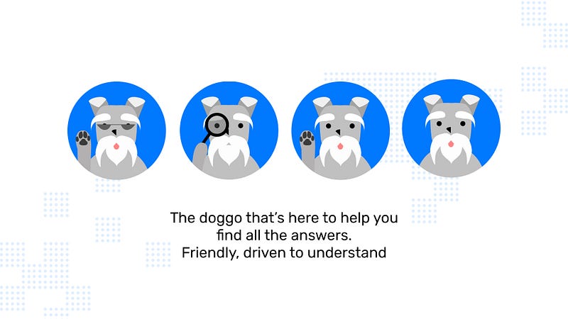
And finally, Bodo our chatbot persona, to help make the user experience fun and smooth.
View the full app prototype here.