

Security is an important and undervalued part of our tech industry, especially in design. This review seeks to analyse how Canadian banks convey the security of their software to users. In today’s world, and going forward, it is imperative that users are made aware of how the software they use protects them.
A quick summary of what’s to come:
- What is Security UX? What we are looking for?
- RBC Mobile
- Scotiabank Mobile Banking
- TD Canada
- CIBC Mobile Banking
- A banking app with good security UX
- Why Security UX is important
Each section will have a small tldr for a quick summary :)
What is Security UX? What we are looking for?
In a world bombarded with bad security, as a company you want to ensure your users that your security will keep them safe. But how do you communicate that? Especially since security is notorious for boring users.
Good UX and design can improve security in several ways. First, by improving users awareness where things are unsecure (think Google’s HTTPS warnings). Second, by prompting users to make more secure choices. And third, by making users know how they’re being protected. These all contribute to Security UX.
In this review, we will be looking for these cases of Security UX in the onboarding process of four Canadian banking applications: RBC, Scotiabank, TD and CIBC. To make it more fun, we’ll approach each app under the guise that we’re a user looking for a faster and more seamless banking solution but are concerned about its security. In other words, we want to use the app, but we also want to know if it’s safe. This means we will walk-through the app trying to make the most secure decisions possible and looking for more information on the app’s security.
tldr; Security UX is using design to make users feel and be safer. This review goes through the onboarding of the RBC, Scotiabank, TD and CIBC banking apps looking for how the app asks us to make decisions about our security and how the app makes us aware of how we’re protected.
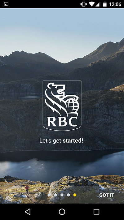
RBC Mobile
The setting: we are a user looking to do cool things with the RBC Mobile app, but we also want to make sure it’s safe.
These screenshots were taken with a Nexus 5 which does not have a finger print sensor, so additional security features offered by RBC’s app regarding the finger print sensor were not captured here.
Walk-through
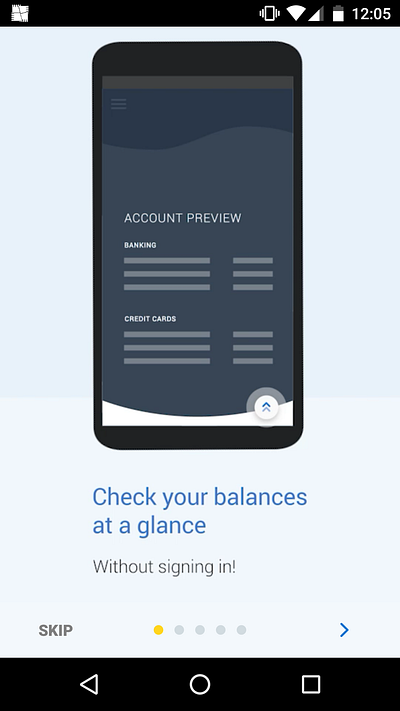
The application opens to a onboarding panes of how the app can be used. I thought it was very interesting that the first screen of the app exclaims that you don’t have to sign in to check your balance. At this point, eyebrow raised, but as a user that really wants to use the app, I’ll continue on. I skipped screenshots of the middle panes but at this point I’m pretty excited to get started. Upon dismissing the onboarding panes the user is given a list of decisions, but curious to find out more about the app’s security I’ll go exploring first.
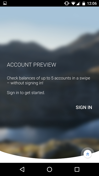
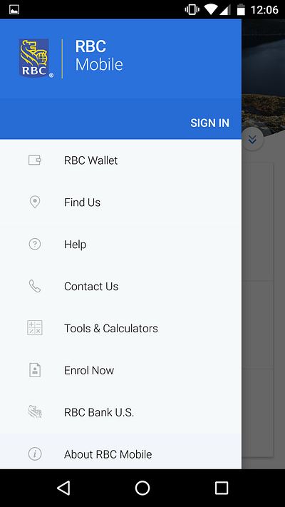
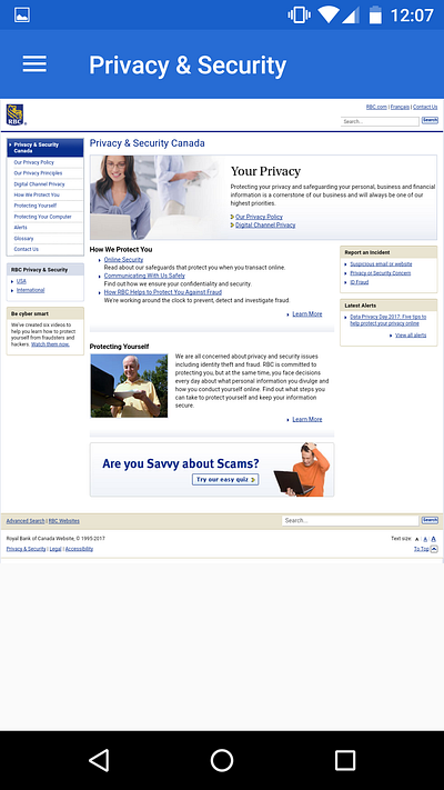
The button overlapping the image to the right of the screen, scrolls down to show the Account Preview where we’re prompted to sign in again (even though we were totally told we didn’t have to sign in earlier). Closing that, the hamburger menu in the top left opens to a list of features offered by the app. One of those (not shown) is “Privacy and Security”, this is what we’re looking for! It opens to a webview of RBC’s Privacy and Security webpage which has all the necessary information for what we’re looking for but hiding the information this way is not good security UX.
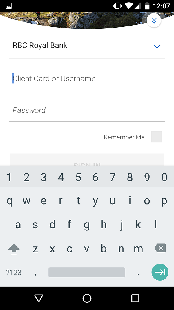
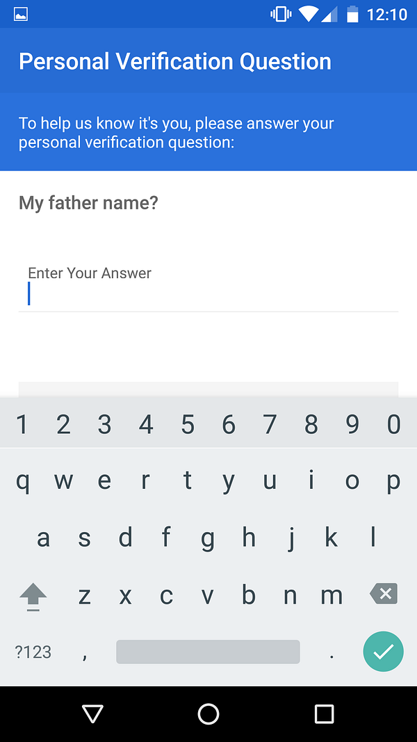
Let’s go ahead and sign in now, where the app prompts a verification question! This is an example of opinionated design, users are not given options of which way they can provide verification, nor are given a choice of which verification question to answer. Assuming this question is randomly selected each sign in, this is good security UX. (That being said, I realize that security questions themselves aren’t very good at providing security, but it’s the UX that matters in this article.)
Walk-through tldr; In terms of UX making users make good security decisions, the app using very opinionated design on log in is good security UX. In terms of UX making users aware, the app flops. Users need to understand the risks and the work being done to mitigate those risks — the app hiding this information in the back is no good.
Improvements
The beginning panes are a great way to talk about security because it forces concise copy and graphics to assist comprehension. I would add a pane for security, something short and sweet that links to more information.
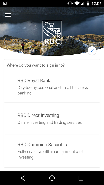
The current design is built on the premise that you can see different things in different places. This is to make a user’s experience with the app quick and brief. I respect that design choice, but I think that it doesn’t belong in the onboarding flow. User’s need to understand that the app can handle different assets with different security measures and the current design does not handle this well. It would make a lot more sense to have a general sign in to your “main account”, giving you access to Quick View and RBC Royal Bank sections, and allow for explorations into other assets later on.
RBC tldr; Design choices made in this app do not prioritize security enough, though some effort is made by being very opinionated upon actual sign in. Additionally, design of the app in general is messy. That being said, it can be very easy to change the current design to be more concise and to emphasize security more.
Scotiabank Mobile Banking
The setting: we are a user looking to do cool things with the Scotiabank Mobile Banking app, but we also want to make sure it’s safe.
These screenshots were taken with an iPhone which does have a finger print sensor, so additional security features offered by Scotiabank’s app regarding the finger print sensor are expected.
Walk-through
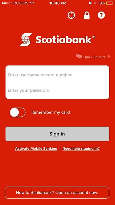
The application opens to this mess of a screen; seven buttons, 3 of them not able to convey their purpose, one toggle and only twenty-nine words to help you make your decision.
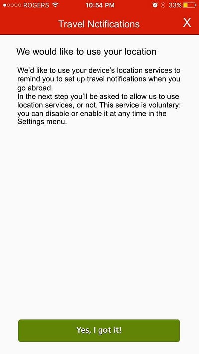
Starting with the icons at the top, the leftmost is for Location and takes the user to a “pre-prompt screen”. This is a popular design tactic to explain what the app needs a permission for before prompting for it. This is an attempt at good security UX! Unfortunately, not the best implementation (explained below).
The middle “lock” icon takes users to Scotiabank’s Mobile Banking Security and Privacy site, which is a little wordy for an onboarding flow but actually provides good information.
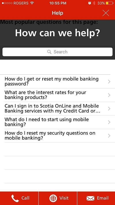
The rightmost “question mark” icon takes users to this help page, which also doesn’t belong in an onboarding flow.
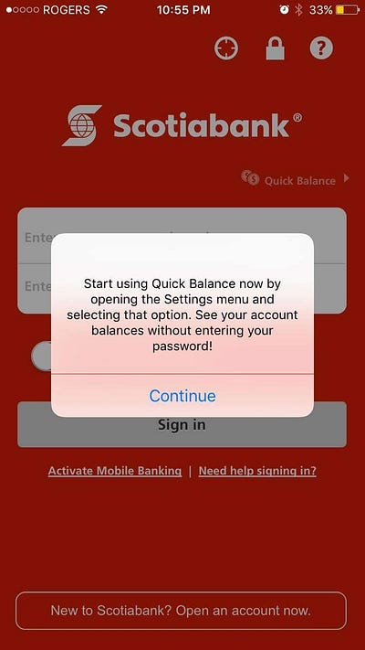
The “Quick Balance” button creates this alert to tell you more about the feature, but then does nothing on “Continue”, since it requires log in at least once before use. Why is it even here?!
In character, the user we are is satisfied with the information provided from the “lock” icon and goes to sign in. The app prompts this security question page, same comments for RBC’s verification question page apply here. Good, opinionated design making for good security UX.
Walk-through tldr; In terms of UX making users make good security decisions, the app scores similarly to RBC. In terms of UX making users aware, the app scores much higher. The Security and Privacy page convey’s necessary information to users although ideally the information would be more concise and more visible, instead of being hidden behind the “lock” icon.
Improvements
The biggest issue with Scotiabank’s app is that the design is a home page with an onboarding flow squeezed in — except the full onboarding experience didn’t fit, so they just hacked off what didn’t fit and threw it out. Scotiabank could give a much better security UX (general UX too) if they properly implemented both.
This onboarding flow could remove the location, lock, “Activate Mobile Banking” and “New to Scotiabank” buttons from the home screen, bringing the total number of buttons on the screen to 3. The onboarding flow would then go through each of them one by one, “New to Scotiabank?”, if no “Activate Mobile Banking?”, if already done “Check out how we keep you safe and your information private”, then “Allow us to use your Location to give you travel reminders?”. The benefits of this is better user comprehension and adherence (I wonder how many Scotiabank users have location notifications turned on?).
The phone being used here has a finger print sensor (Apple’s Touch ID no less) so why isn’t it being used?!
Scotiabank tldr; Design choices made in the Scotiabank Mobile Banking app seriously limit what can be done for security UX. This is quite frankly a bad app.
TD Canada
The setting: we are a user looking to do cool things with the TD Canada app, but we also want to make sure it’s safe.
These screenshots were taken with a iPhone 5 which does not have a finger print sensor, so any additional security features offered by TD’s app regarding the finger print sensor were not captured here.
Walk-through
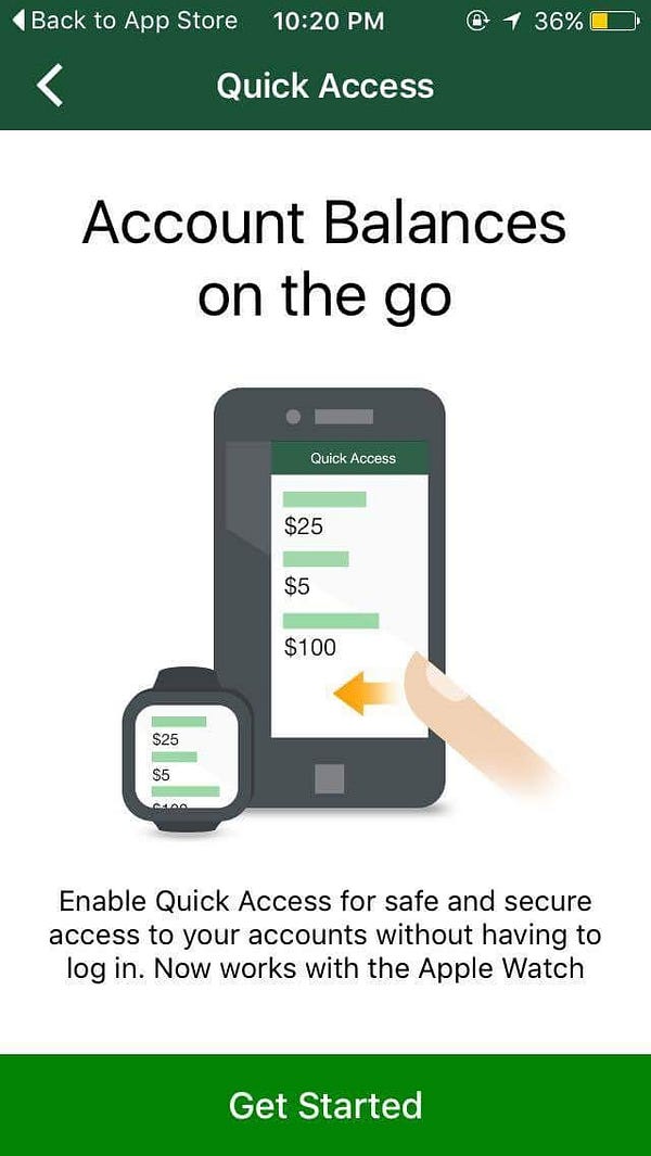
Upon opening the app, TD Canada first promotes their Quick Access feature. This critique goes for Scotiabank and RBC too, you can’t promote avoiding security as a feature.
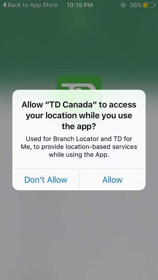
Here is an example of an in-flow permission prompt. This prompt is lacking some type of “pre prompt screen” like Scotiabank had and thus as a user we don’t really understand what “Branch Locator” and “TD for Me” do.
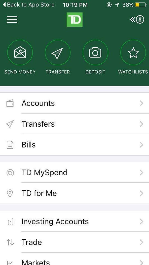
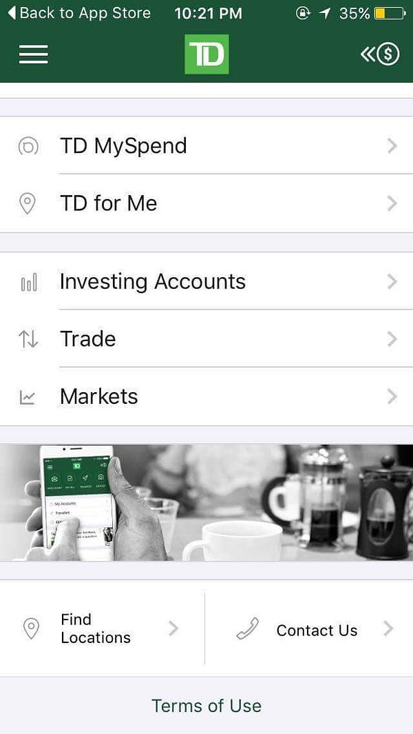
As an excited but concerned user, am I happy to be thrown right in? I quickly scroll down to look for additional security information and find nothing.
Most of the list items ask me to log in — it seems like the TD Canada app also doesn’t like onboarding, but instead of half-implementing it, the app avoids it completely.
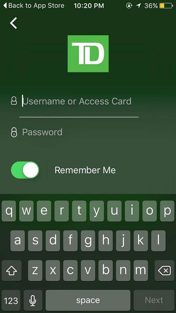
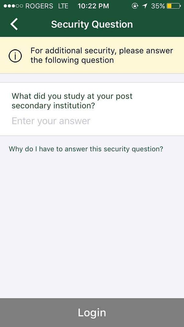
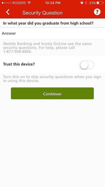
On sign in, we’re prompted for a security question! The copy here is great! We’re told that this provides additional security AND we have the option to learn more. Great security UX (same problem with verification questions in general though, I’m pretty confident we all can answer this question….).
Walk-through tldr; In terms of UX making users make good security decisions, the app scores similarly to RBC and Scotiabank, and for the same reasons as well. In terms of UX making users aware, the app is easily the worst. The TD Canada app makes absolutely no effort.
Improvements
Like Scotiabank’s app, the TD Canada app needs to include an onboarding flow. This point is especially necessary since the app doesn’t have a home screen either.
This design attempts to satisfy a popular and “good” design practice which is to get users into and using the app straight away. The idea is that users hate manuals and would much rather learn on the fly. I actually agree with this theory, but I think the way TD implemented it here is very bad.
TD tldr; Design choices made in the TD Canada app also seriously limit what can be done for security UX. TD somehow made a worse app than Scotiabank.
CIBC Mobile Banking
The setting: we are a user looking to do cool things with the CIBC Mobile Banking app, but we also want to make sure it’s safe.
These screenshots were taken with a Nexus 6P which has a finger print sensor, so additional security features offered by CIBC’s app regarding the finger print sensor are expected.
Walk-through
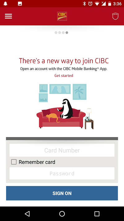
Upon open, we’re prompted to open an account and similar to RBC, we’re shown what we can do with the app in panels. Skipping ahead, we’re prompted to sign on with more panels. The panels are decent for shoving information, but nothing here is about security.
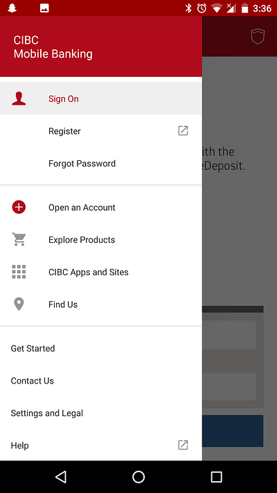
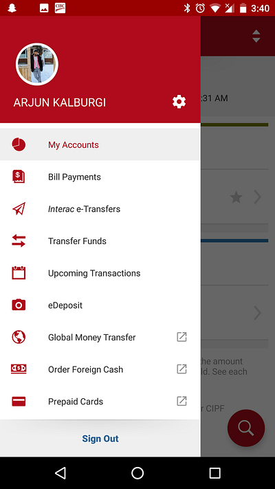
There’s also a hamburger menu icon and shield icon in the corners. In character again, we’ll check those out first. The hamburger menu has nothing of significance, Settings and Legal comes close but contains very little information that contributes to security ux.
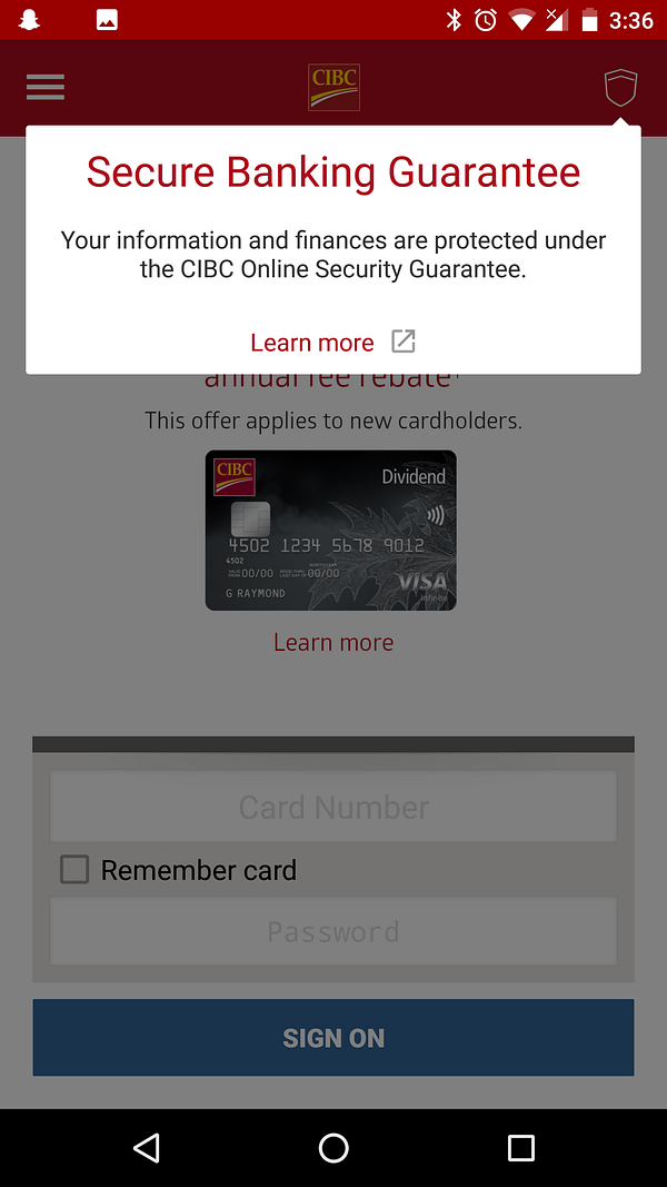
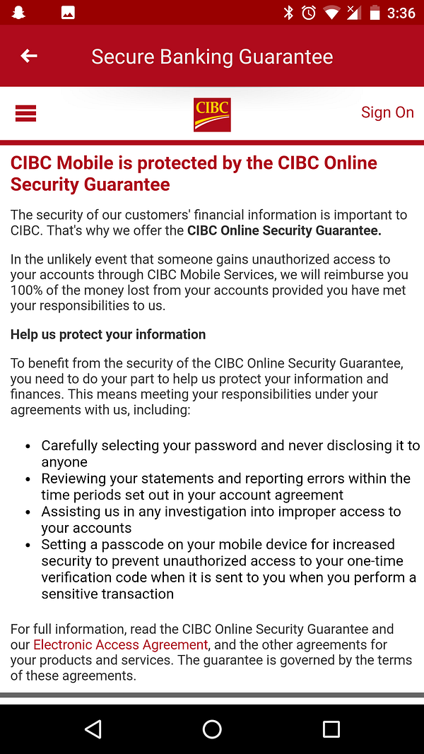
The shield however is exactly what we’re looking for as a user. This is what all four other apps lacked. As a user we’re “guaranteed” secure banking, how much better can you get? Clicking “Learn more” takes us to this disgusting page explaining the CIBC Online Security Guarantee. This page can use work, but as a user we’re satisfied.
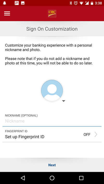
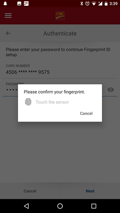
Signing in doesn’t prompt a security question, but instead prompts a customization of the flow in the future. A picture and nickname provide personal touches, and the inclusion of the fingerprint sign in option is great! Fingerprints are widely accepted as a strong security feature and so using it here will make users feel very safe with keeping this app on their phone.
It uses the phone’s pre-set fingerprints too. This makes this process seamless.
And with that, we’re into the main app!
Walk-through tldr; In terms of UX making users make good security decisions, the app scores similarly to the others. Although it doesn’t have a security question, it gives the option to sign in with your fingerprint so it balances out. In terms of UX making users aware, the app scores slightly better than Scotiabank, it’s all in the phrasing “guarantee” is a great word.
Improvements
CIBC can make their security guarantee more central. Keeping it in one of the panes would be just fine.
The app can also be more opinionated with their fingerprint feature. Force users to make good security decisions!
CIBC tldr; Overall this app is the best of the bunch. CIBC’s understanding of general UX helps it greatly with it’s security UX.
A banking app with good security UX
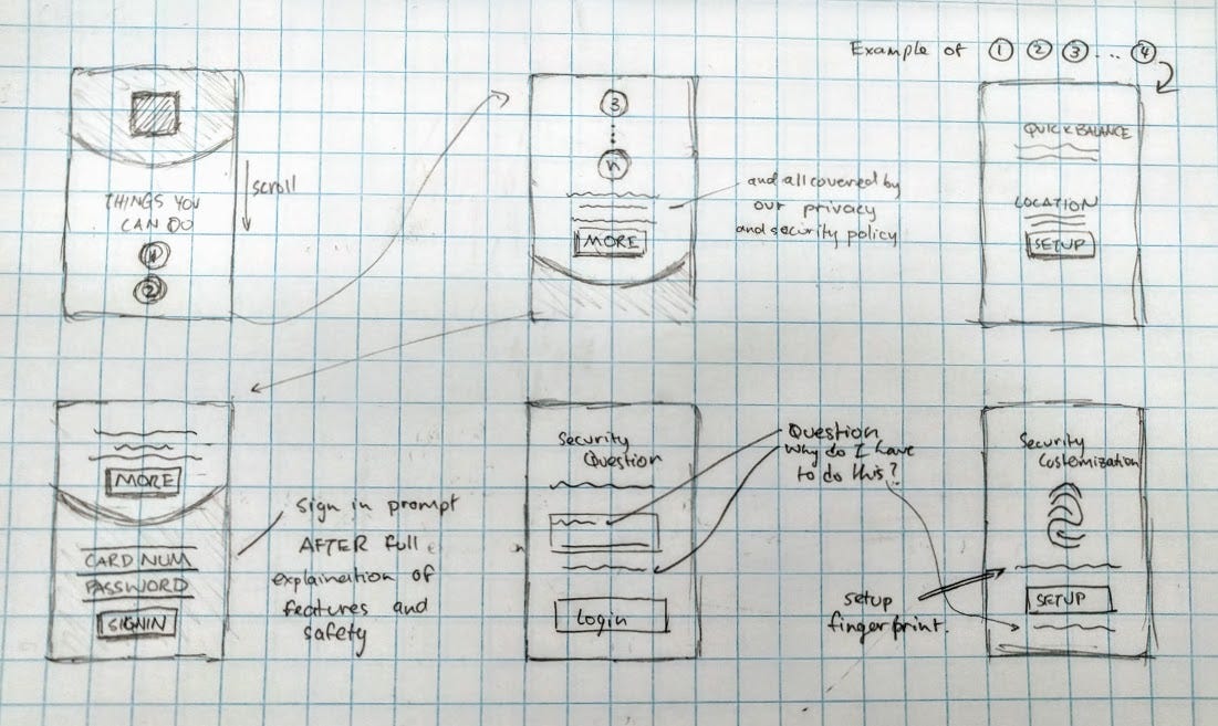
This is my proposal of what a good security UX onboarding would look like. The app starts with a long scrolling page (as opposed to the panels) to get users to check out features before they sign in. This prepares and hypes our users to use the app to the fullest.
The last of these would be about the privacy and security policy, and would be in view while users put in their card number and password. This way the user is forced to have this section on the screen for a longer time period.
The security question page is implemented like TD’s app and the security customization page takes inspiration from CIBC’s. Both these pages exemplify opinionated security ux with also explaining what this is for, and also providing more information if necessary.
I honestly think this is sufficient to have a good security ux onboaring flow. It doesn’t have to take a lot to give users the tools for them to comprehend and force them to adhere to a standard of security measures.
Why Security UX is important
I think one big misconception in today’s UX world is that users don’t care about security. And for the the past while, that might have been more or less true. Security UX marks a departure from that notion. Users do and will care more than ever that the products they use keep their information safe. By making users aware of how that is happening, and by forcing users to go through additional security measures this can be accomplished. With good security UX, that doesn’t have to be the tedious process that it was in the past. It’s time for design to step up in the security world.