

Stress overwhelms people, but why? Prioritizing tasks and activities requires one simple trick, understanding that you can only give 100%.
Objective:
While taking a UI Design course at RED Academy in Toronto, I stayed with my grandma for 4 months. She was pretty busy over that time with an assortment of events and activities that required planning and prep work, all of which stressed her out beyond belief.
I realized that I took my own stress management skills, built up over 5 years of my engineering degree, for granted. Some people just can’t help getting stressed under the pressure of a todo list, my grandma was proof.

I reasoned that part of her stress came from not keeping a proper physical list, but also from being unable to recognize what tasks required more time and energy relative to others. This would lead her to become overwhelmed by the workload she had in front of her. If she could understand that she is only capable of 100%, whether that be 100% of the time in a day or 100% of her energy, she would have a much better time focusing on what matters as opposed to stressing out.
The objective of “Stressful Tasks”
“Stressful tasks” is a simple tool where users can list and rate their tasks when they feel overwhelmed. The tool helps them understand what to prioritize and calm them down.
Designing Stressful Tasks:
Design Inception
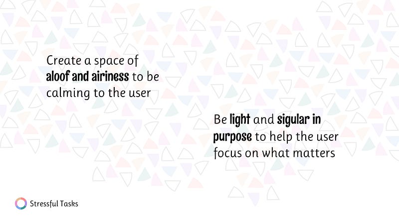
In order to achieve the calming effect of the app, I wanted to go with a calming design language.
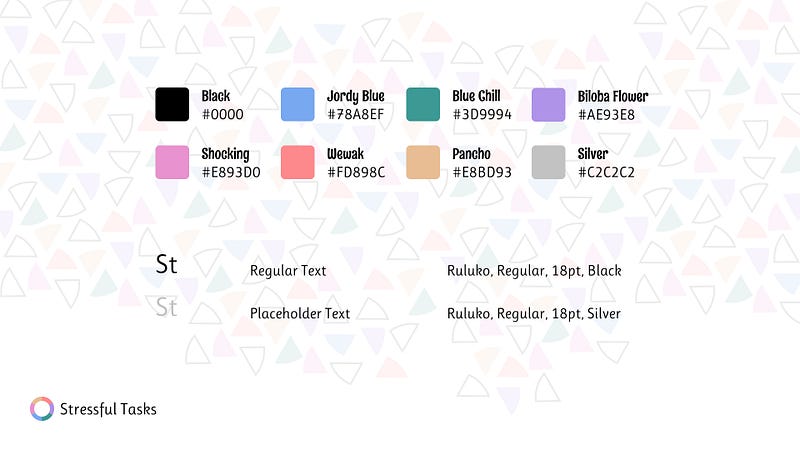
Style Guide:
This design language uses pastel colours and features white space, both help to bring a tranquil experience. The doughnut chart is the center of the app’s design language, a unique visual that easily communicates task priorities to the user.
Interface:
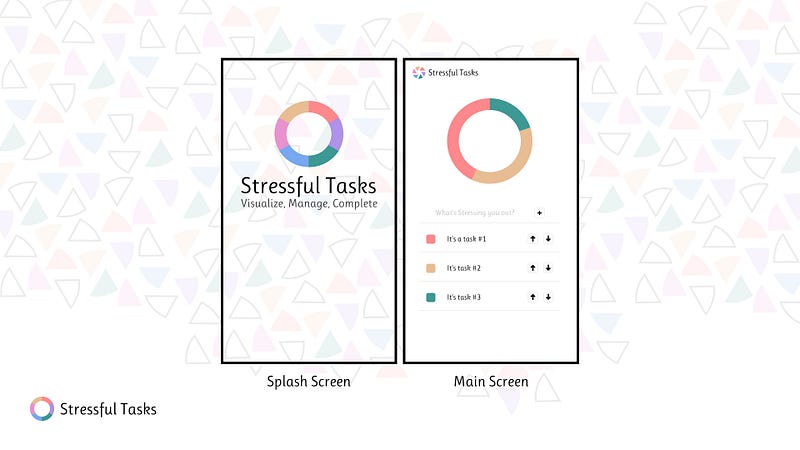
Thanks to the strong pull of the doughnut chart, the design of the app can be very simple and stripped down. In only one screen, I feature the list of tasks and the doughnut chart. This should be sufficient to achieve the desired objective.
Coding the Design
Ionic Framework
After my previous React Native project and being restricted stylistically by React Native’s StyleSheet, I wanted to use Ionic Framework. I typically use Ionic for smaller scale apps because of how fast it is to develop them. I love Ionic Framework as a good way to quickly do your side projects.
BEM
Another positive of Ionic Framework is that it uses basic HTML and CSS, allowing me to try BEM, the CSS classification methodology. (I write about BEM and my experience with it here.)
chart.js
I specifically wanted the doughnut chart to be animated. I want to start animating more of my apps because I realize how powerful animations can be. I used chart.js because it comes pre-built with animations. The updated function is as follows: this.doughnutChart.update();
The Results
Once I finished the app I immediately began showing it to friends and using it myself. The little experiment sparked much discussion, both on its visual and behavioural design.

Visual Representation
The discussion around how Stressful Tasks visualizes priority of the tasks garnered the most attention. This is because most apps do not have a visualization component, thus Stressful Tasks got a lot of praise for it.
There was however a lot of feedback and confusion of what the doughnut chart was supposed to represent. In the design phase, I intentionally left it up to the user to designate value to the tasks. Unfortunately this didn’t fly for a lot of people.
Potential solutions discussed would all end up making the app more complicated. One solution was to change the chart to be a 2-axis, priority vs. difficulty plot, where users can plot their tasks by rating them and so can easily see where their stress is most required. This would be an interesting and extremely useful method, but there is no way someone would use such a complicated app when they feel so overwhelmed and stressed out.
Behavioural Design
Turns out the app was pretty difficult to use as is. Both the UI and UX design choices made the app brutal to use. In an overwhelmed and stressed out state, the app is just too slow to use.
I think one big oversight of my design was not properly prioritizing the behavioural design of the app. When you feel overwhelmed the most important thing to do is to dump out your tasks and visualize them, but this behaviour is not supported thanks to the small button sizes and the slow input for adding new tasks.
I think the best improvement would be to introduce a bottom fixed chat style text input for adding tasks (like many messaging apps) and integrate the functionality for modifying task priorities with the doughnut chart in an interactive way. These two things would essentially eliminate the buttons of the app in an attempt to “get out of the way” of the user.
The app has a lot more visual design issues than mentioned here, I encourage you to try it out on both mobile and desktop and try to discover them!
Try it out
Go to this link! The app is on the web, so you can try it on your desktop or on your phone.