My first design project as a part of the course I’m taking at RED Academy
Bolded are terms I learned from the course and should be looked up if you want to learn too. 😇
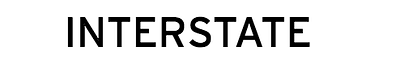
The first project of my new design course is to build a landing page for a given font. I was assigned Interstate, the font that’s built for getting attention. In my first proper design project, I struggled process and creativity of creating art but learned a lot.
About Landing Pages
Landing pages are websites that are designed to “convert” it’s visitors to a sale or a further step of the sales process (email signup or start using a service).
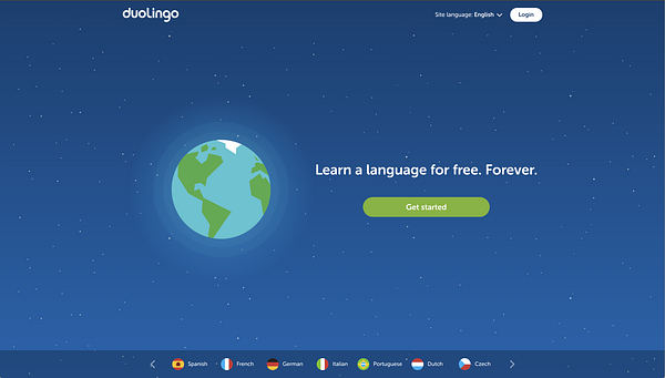
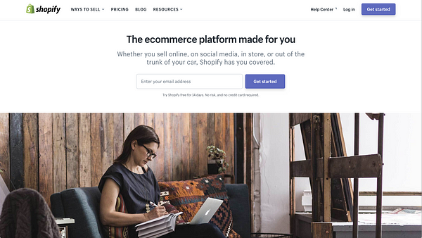
Duolingo and Shopify are examples of the two types of landing pages, Click Through and Lead Generation, respectively.
My landing page is required to convert potential designers that visit the page to download the font to use in their designs.
About Interstate
Tobias Frere-Jones created Interstate for US federal highway signage. The font was designed to be read on the road; it’s clear and legible with it’s highly discernible characters.
Interstate itself is pretty unique as a font. It has a highly versatile font family in that the lighter fonts and the heavier fonts can be used in nearly any case. Using either lighter and heavier variants, Interstate can be used in font pairings in any use (header text, body text, etc). This feature can be used to create contrast, exemplifying the purpose of Interstate, to get attention.
Design Inception to Visual Language
I used a design inception sheet to lead me to a visual language for my landing page. To build a landing page that communicates the purpose of interstate, I thought about the moods necessary to showcase that purpose.
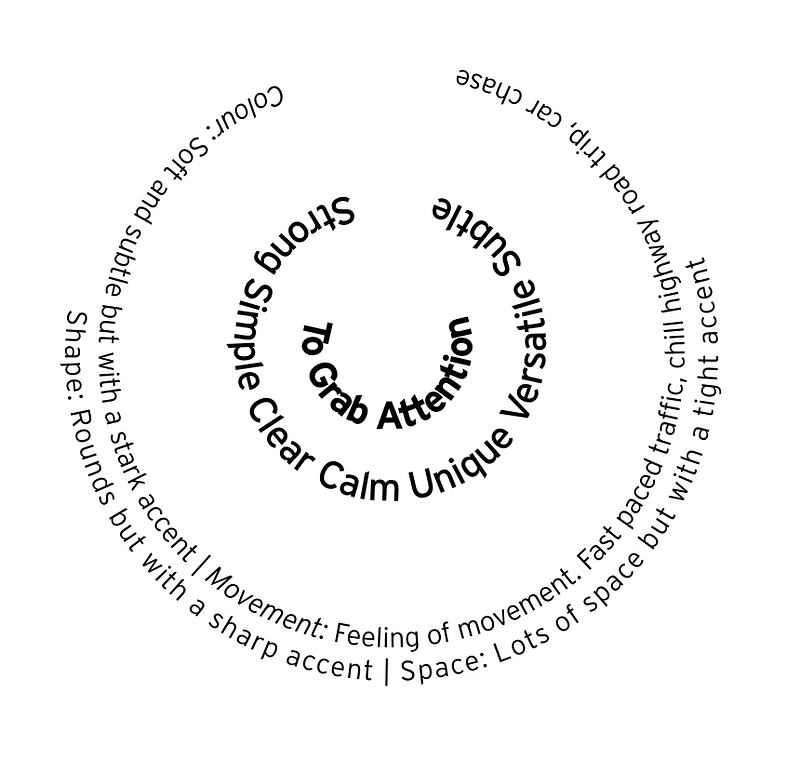
To get attention, Interstate can use it’s versatility. Interstate can feel calm, unique, subtle, strong, simple or clear. To do that, I need to create some type of contrast with the visual language.
I decided to keep the focus on movement based on cars and roadways, using the lack of the other three elements (colour, shape and space) to build the contrast.
Mood Boarding
With these elements in mind, I created two mood boards using Pinterest. The mood boards helped me get inspiration for designs and learn more about can be possible with the visual language I want to achieve.
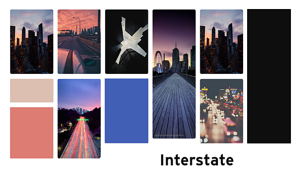
The left board is designed after a chill road trip, after all Interstate was made for freeways. I loved the simplicity and associated calmness from the topology graphics. The right board keeps with the road motif but goes into the city. The beauty and stillness of the busy city shots really fit with my desired visual language.
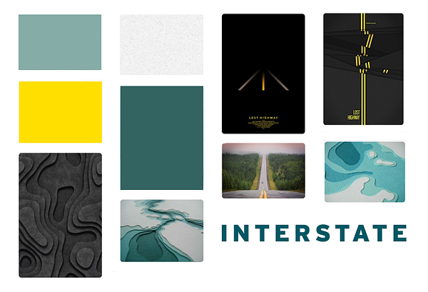
Style Tile
Mood boards are quite vague, so style tiles are used to help capture the mood from the mood board but are laid out in a more useful way.
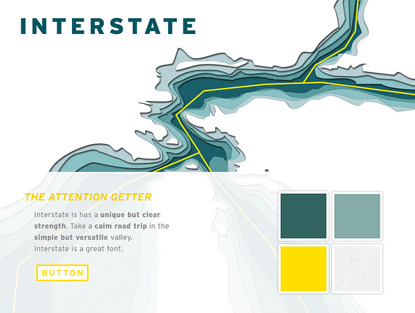
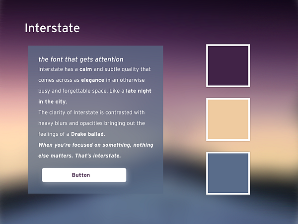
The “night in the city” tile captures the mood much better, but I liked the idea behind the topology better and chose to go forward with it instead.
Mockups
I didn’t properly create a mockup at first using the style tile as a mockup instead, a mistake. The photoshop layout messed up my visual process, originally the design was more like a poster than a website. I think doing this part of the project better (including mood board elements of website designs) would have significantly helped me.
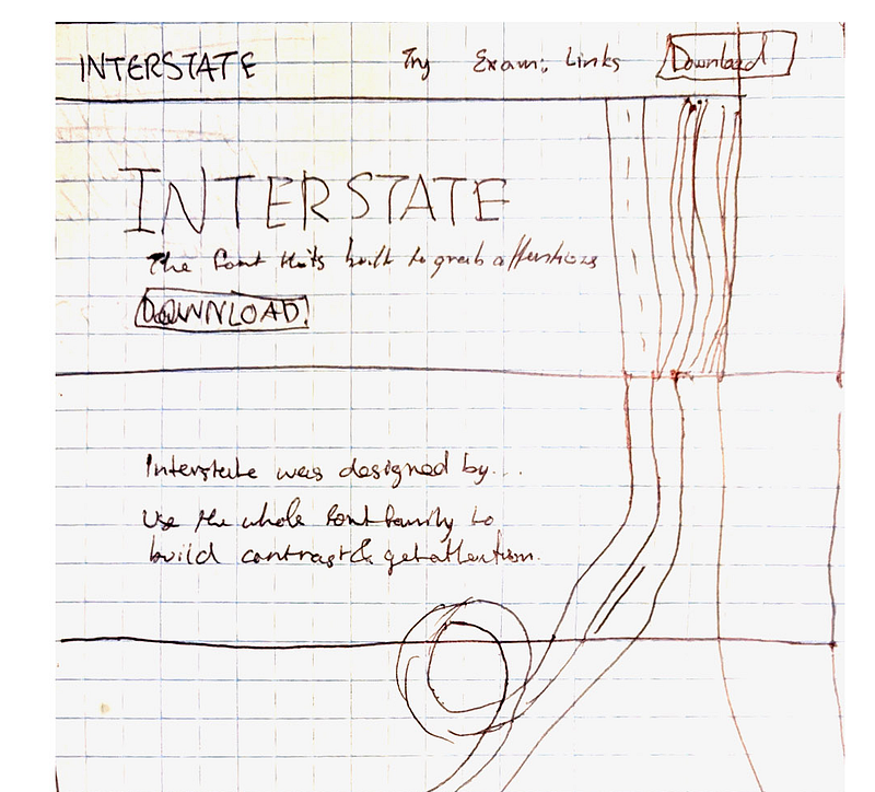
The final mockup, some of it shown above, was created after looking at other websites for inspiration of web elements and getting some inspiration from my instructor.
Final Result
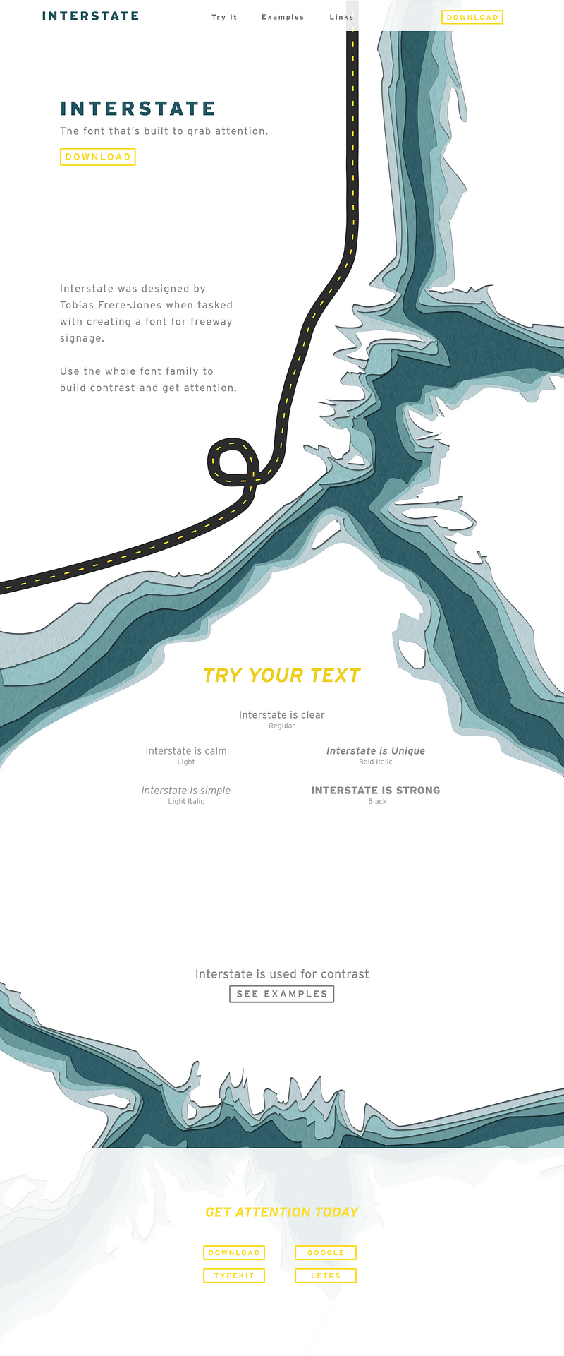
The final result still had much of a poster design and doesn’t convey any visual language at all. On top of that it doesn’t really bring much attention to the font either. I have a long way to go as both a designer and artist.
I learned a lot about both from this project. This was the first time I had ever used mood boards and it shows — they are too vague. I feel that if I took more time to explain the visual language from the design inception, it would have carried into the mood board and through all the way to the final design.
Additionally, I tried to do a lot of the project slightly off-board from the process suggested to us and got burned bad.
I think that by following the process better and working harder on visual language (and finding inspiration for it) I can do much better in future projects!
Actually I’ve already been improving! Check out my github for all my design work!